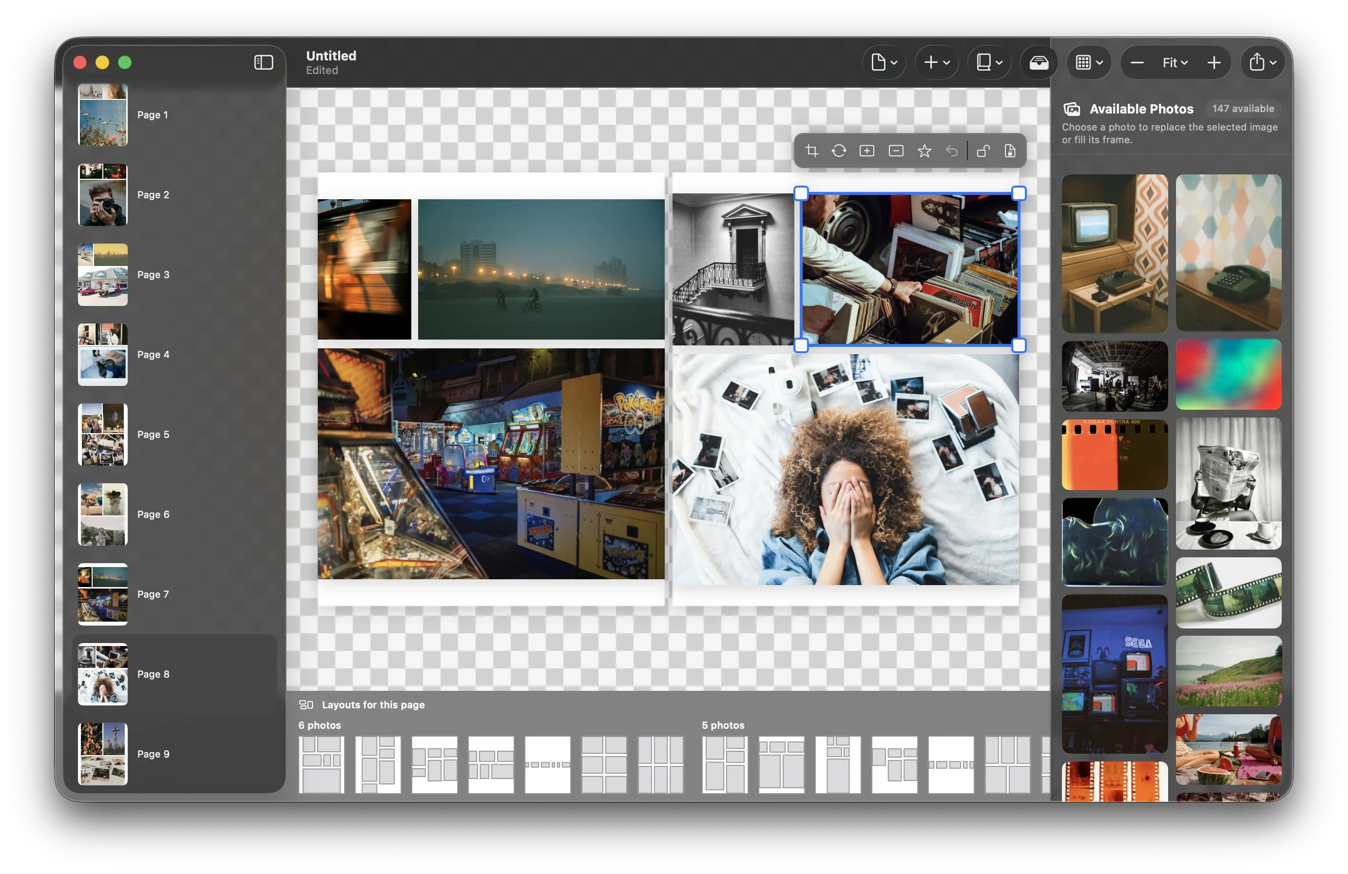
Masonry layout is one of those web ideas that feels inevitable in hindsight. Give it a set of images with different proportions, choose a column width, and let the items settle into the available space. Pinterest made the pattern famous. JavaScript libraries industrialised it. Modern CSS is bringing it closer to the platform itself.
So why, after more than a decade of masonry grids on screens, does making a photobook still feel like desktop publishing in miniature?
On the web, empty space is cheap
A web page can keep growing. If one column runs longer, the document simply gets taller. The reader scrolls. A masonry algorithm only needs to make a locally sensible decision: put the next item where it leaves the smallest gap.
A printed spread is a closed system. It has a fixed width, fixed height, a gutter you should not cross carelessly, bleed at the edges, and a finite number of photographs that must all fit. There is no “more page” below the fold.
Photographs are not interchangeable rectangles
Layout engines see width, height and aspect ratio. People see a face near the edge, a horizon that must stay level, a quiet image that needs room, or the one photograph the whole trip was really about.
A technically perfect crop can remove the subject. A mathematically balanced grid can give a receipt the same visual weight as a wedding portrait. Two images taken seconds apart may belong together; two identical aspect ratios may not.
The missing layer is scoring
The useful model is not one clever masonry rule. It is a generator followed by a critic. First, generate many valid arrangements: known templates, recursive page partitions, rows that share a height, columns that share a width. Then score each candidate against the qualities a designer would notice.
- Crop cost: how much of each photograph disappears?
- Focal safety: does the crop preserve faces and likely subjects?
- Balance: does visual weight feel intentional across the gutter?
- Rhythm: are consecutive spreads varied without becoming chaotic?
- Hierarchy: does the hero image receive enough space?
- Print safety: are bleed, trim and gutter constraints respected?
The highest-scoring layout is not “correct.” It is the best proposal the software can make with the evidence it has.
Automatic should mean a strong first draft
Photobook tools often choose between two bad promises. Either everything is manual, or “AI” will make a finished book with no input. Real design sits between them.
Automation should remove the blank-page problem. It should turn 180 photographs into a coherent first draft in seconds, preserve the original files, and keep every decision reversible. The user remains the editor: promote this image, keep those two together, regenerate this spread, lock that crop.
Why now?
The component parts have matured. Devices can detect faces locally. Photo libraries already contain timestamps, locations and favourites. Layout generation is fast enough to explore hundreds of candidates interactively. Native apps can do all of this without uploading personal photographs to a server.
That last point matters. Family archives are intimate. A good automatic layout engine does not need to become another cloud service. It can run beside the library, on the owner’s machine, and forget nothing because it never took anything away.
What we are building
PhotoBooks uses templates and generative page partitioning, then evaluates the results with a shared scoring system. The aim is not to imitate a human designer. It is to give every person the part of design expertise that software can provide reliably: proportion, consistency, print constraints and a useful starting point.
The web proved that rectangles could arrange themselves. Photobooks need the next step: rectangles that understand they are carrying memories.
Try the layout engine. PhotoBooks is free for macOS, works offline, and exports print-ready PDFs.
Explore PhotoBooks →